HArvest
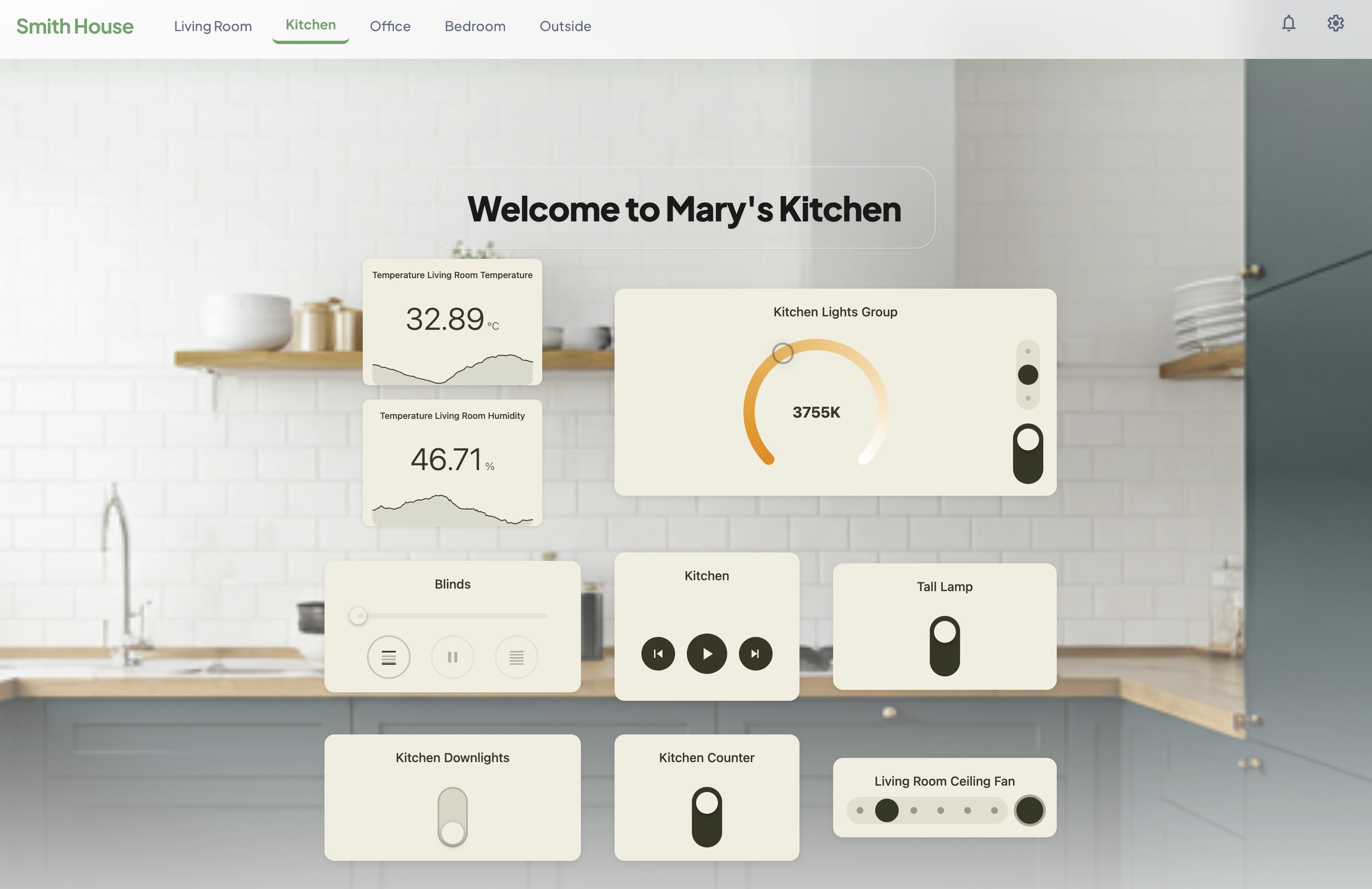
Securely share and control your Home Assistant smart home devices on any HTML or WordPress page.
How it works
HArvest is a Home Assistant custom integration. Once installed, you open the HArvest panel in your HA sidebar and create a widget token - a scoped access key that grants a webpage permission to connect to a specific set of your entities.
The panel gives you a wizard that walks through picking entities, setting permissions, restricting access by origin/IP/schedule, choosing a theme, and generating an embed snippet. Paste the snippet into a page. Done.
Widgets connect from the visitor's browser directly to your HA instance over WebSocket. State changes push from HA to the widget in real time. No intermediary service.
Key concepts
Widget tokens
Every widget has a token - a short random ID (prefixed hwt_) that identifies both the widget and its access rules. The token determines which entities are accessible, whether visitors can control them, which websites are allowed to connect, and more. Tokens can be revoked instantly from the panel.
Configuration hierarchy
Widget configuration flows through three levels. Each level inherits from the one above and can override any value:
Page level:   HArvest.config({ haUrl: "...", token: "..." })
                |
                v
Group level:  <hrv-group>     -- optional, groups related cards
                |
                v
Card level:   <hrv-card entity="...">
In practice, most pages call HArvest.config() once with the HA URL and token, then just drop <hrv-card> elements wherever they want a widget. Groups are useful when you need one section of a page to use a different token or theme from the rest.
Entity tiers
HArvest divides entity types into three tiers:
- Tier 1 - 15 domains with dedicated card renderers (lights, fans, climate, sensors, media players, etc.)
- Tier 2 - any other domain gets a generic card with icon, name, and current state
- Tier 3 - blocked domains (alarm panels, locks, cameras, etc.) that cannot be added to any token
See Entity types for the full breakdown.
Companion entities
A companion is a secondary entity displayed inside a primary card. For example, a binary motion sensor rendered as a pill inside a light card. Each companion has its own read-only toggle, so it can show state only or allow interaction. Companions are configured per-entity in the panel and don't need their own card element on the page.